

Today, we’re diving into a topic that’s both fun and fundamental to your artistic expression – color palettes. Specifically, we’re going to look at the magic of Christmas color palettes for artists, designers, and colorists.
Why You Need a Color Palette: A Rainbow of Possibilities
 If you’ve ever found yourself staring at the pages of a fun-looking Christmas coloring book (like my ‘Delight in the Word: Christmas Joy‘ coloring book,) your heart full of creative energy but your mind stuck on what colors to use, this post is for you.
Choosing the right colors can indeed be overwhelming, but that’s where color palettes come in. They’re like a compass guiding you through the vast sea of colors, helping you to create harmonious, impactful, and visually pleasing artwork.
How to Use a Color Palette: Your Guide to Beautiful Art
Think of a color palette as your personal art guide. It offers a carefully selected range of hues that work well together, ensuring your creation is balanced and cohesive. To use these color palettes, simply pick colors from your chosen palette for your design elements.
I have made it even easier for you by designating Primary, Secondary, Accent, and Neutral Colors. The primary color is what you will use for the majority of your design (including lighter and darker shades of that color.)
Use the secondary color to fill in most of the rest of your design. The accent colors are only used to add small pops of color, and the neutrals can be used as needed.
Whether you’re coloring a charming Christmas tree or designing a serene nativity scene, your color palette will help your artwork come alive!
Celebrate the Season with Joy
Ready to explore the world of color? Here are 7 delightful Christmas color palettes:
(Each image is clickable, so you can easily save your favorite color palette!)
1. Classic Christmas: Traditional and timeless, this palette draws from the rich greens, vibrant reds, and glittering golds of a classic holiday scene.

2. Modern Christmas: For a contemporary look, this color palette pairs bright red with muted greens and a pop of bright yellow.

3. Retro Christmas: Step back in time with warm, nostalgic hues like mint green, vintage coral, and mustard yellow.

4. Merry & Bright: Bursting with joy, this palette combines bold, cheerful colors that radiate happiness. You can use each color an equal amount, with a nice crisp green for your neutral or base color.

5. Pink Christmas: A playful and feminine twist on the holiday, featuring various shades of pink, paired with forest greens.

6. Blue Christmas: This soothing palette captures the tranquility of winter with shades of blue, green, and gold.

7. White Christmas: Embrace the serenity of a snowy Christmas with a palette of whites, cool blues, and a pop of bright red.

Dive Deeper: Uncover the Secrets of Color

Want to learn more about choosing the perfect color palette? Take my course, ‘How to Pick the Perfect Color Palette,’ available only inside the Fruitful Creativity Studio.
And here’s some exciting news! Bloom & Bouquet members of the Fruitful Creativity Studio also get access to these Christmas color palettes as a Canva template. This means you can customize them to your heart’s content, making your artistic journey even more personal and fulfilling.
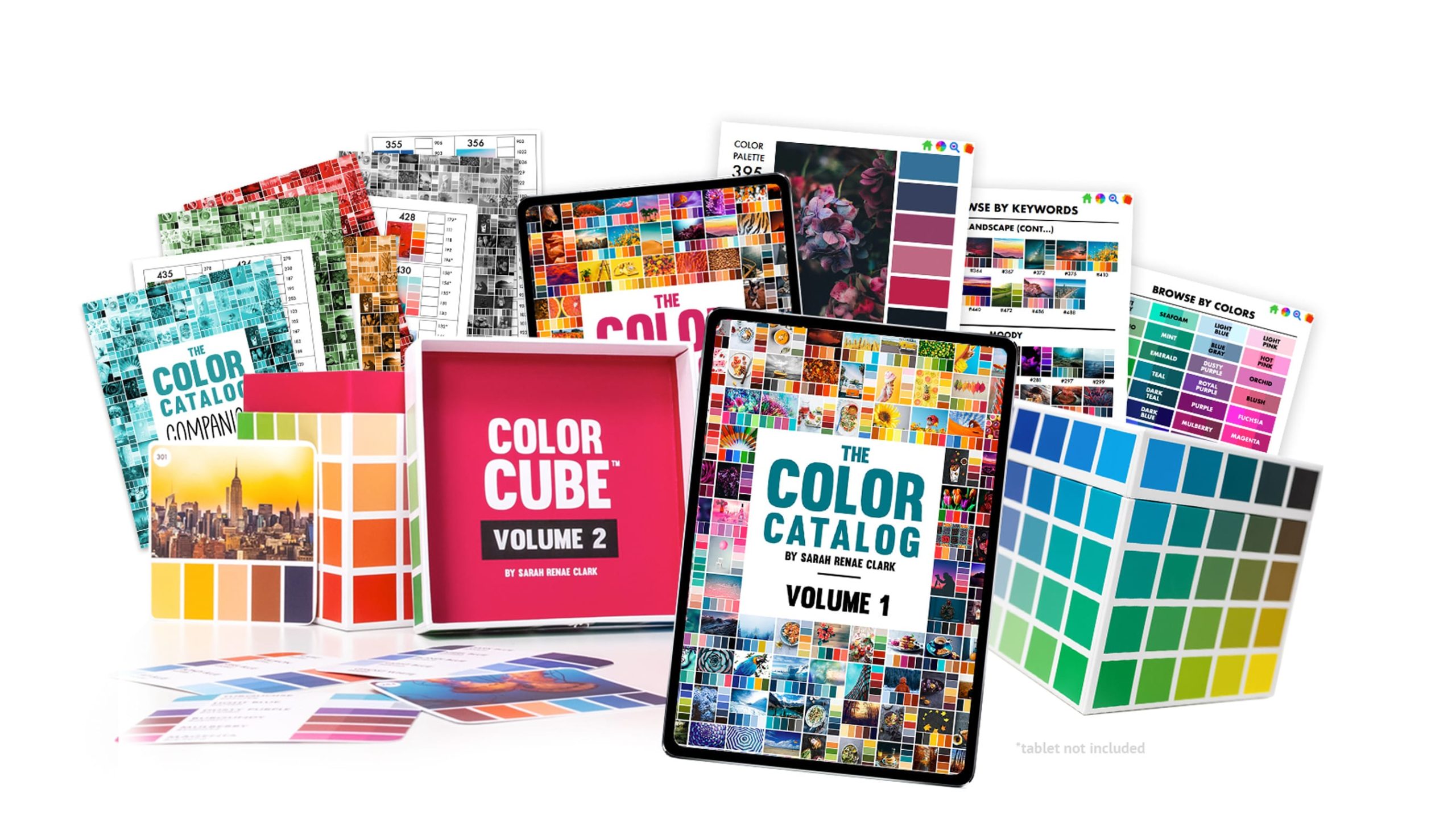
Want the ultimate color palette resource? Check out the Color Catalog and/or Color Cube. (#aff)
The Power of Color
Color is more than just a visual element. It’s an expression of your creativity, your emotions, and your unique interpretation of the world around you. As you explore these Christmas color palettes, remember that every hue you choose is a reflection of the divine inspiration within you. So, go ahead, pick up your tools, and let’s fill this Christmas season with color, creativity, and joy!
Pin the image below to save these color palettes!


